When decorating any room in your home, color is of the utmost importance, especially in the kitchen because the room usually functions as the center of the home with the most activity. Here are a few colors to make your kitchen come to life.
White
Designers often prefer neutral colors and earth tones. White is usually toward the top of the list because it is as neutral as it gets, while still adding a freshness.
S.A. Jernigan, interior designer for Renaissance Design Consultations, says, “A white kitchen automatically injects crispness, regardless of what accent colors it’s paired with.”
White won’t conflict with your cabinets or accessories and isn’t limited to particular eras. It goes with everything. If you think that white doesn’t have enough flavor for your kitchen, you can accentuate the scene with other colors to create a vibrant mixture.
Yellow
Since you will spend a lot of time in your kitchen, you want it to have a happy vibe. Yellow is a traditional kitchen color. Depending on which shade of yellow you pick along the spectrum, your kitchen will have a different feel. If the yellow is too bright, it could be nauseating or distracting. If it is subdued, it will lend a sunny and friendly atmosphere to your kitchen. Since your family will spend lots of time in the kitchen, it is important to pick a color that provides warmth and comfort.
Gray
This works especially well if you have predominately stainless steel appliances and want to keep that theme going. Whereas yellow gives a classic look, gray will lend a contemporary, more modern aesthetic to the kitchen. Some people find gray to be too sterile, but this is simply a matter of taste. If you like avant-garde, chic or minimalist decor, gray will suit your needs. When combined into white and black patterns, gray looks particularly stylish.
Tuscan colors
The Tuscan style has been popular for years. It incorporates a variety of soft and refined colors associated with the Tuscany region of Italy. Beverley Kruskol, owner of M.Y. Pacific Building (a painting contracting company), described Tuscan colors as muted, giving a serene, outdoorsy feel, reminiscent of a countryside. The Tuscan palette covers burgundy, olive green, yellow-gold, cream and variety of other delicate hues. The key is in the delicate balance. If pulled off properly, your kitchen will have the allure of a Tuscan villa or Renaissance painting.
Brown
Brown is another earthy color. It works well for people who are especially fond of wood decor and ski lodge-type atmospheres. But you don’t want to overdo brown. If you have too much of it, you risk turning your kitchen lifeless and dull. Jernigan says, “A key principle in design is that our eye is always searching for contrast, so kitchens are most lively when a strong color story of two colors anchored by one or two neutral colors is employed.” For a primarily brown kitchen, include elements of other colors to give it a dynamic character.
Red
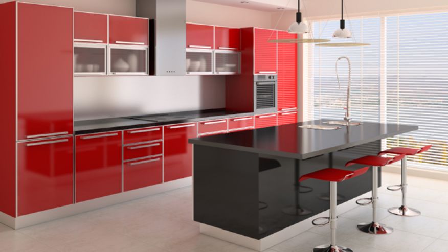
The restaurant industry has been using red for years because it has been known to subliminally increase one’s appetite. Kruskol recommended it for high energy, type-A personalities. It can heighten emotions, and for that reason, it is a hard sell and depends on one’s tastes. If you plan to entertain many guests, this might be the color for you.
Link to original article here.
