By FOX News Magazine

October 11, 2013 

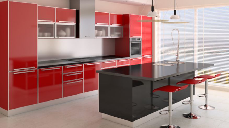
Painting your bedroom fiery red to welcome the cheery holiday season may sound like a festive idea, but it could possibly put a damper on your sleep.

READ: Outfit Your Bedroom for a Better Night’s Sleep

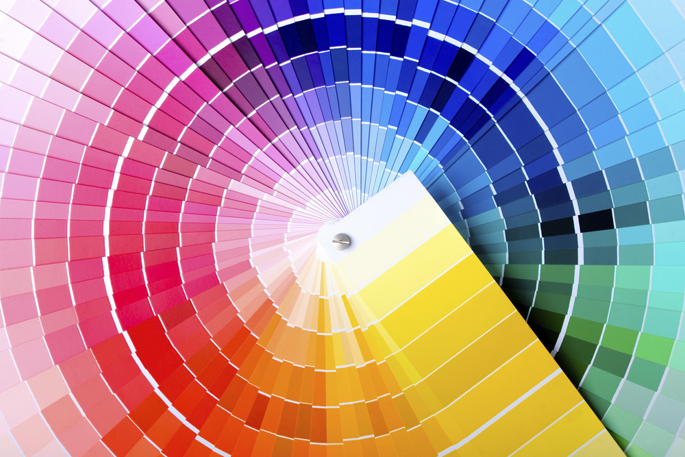
Many experts believe that the shades you use for your home can also impact your well-being, as well as the well-beings of those within your space.

“Room color, particularly in your home, can dramatically affect moods, feelings and emotions,” explains psychiatrist Dr. Julia Shugar of Creedmoor Psychiatric Center in New York. “When it comes to decorating, it is important to choose wisely. Of course, perceptions of color are somewhat subjective. Your feelings about color are often deeply personal and rooted in your own experience or culture.”

While everyone has their own personal takes on color, finding the right shade for your home means more than just picking up any bucket of paint that looks appealing. Experts say it’s just as important to truly analyze how a color makes you feel, rather than sticking to design trends.

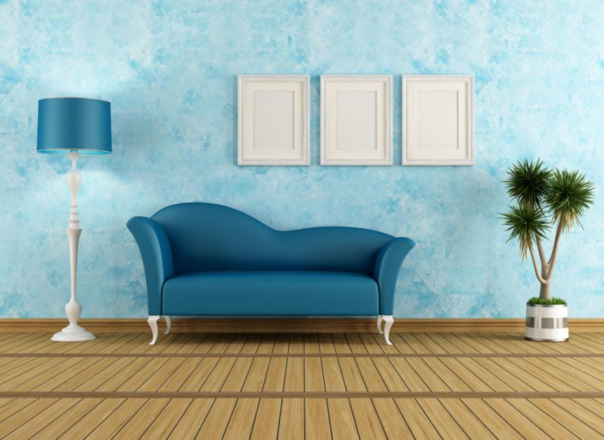
“Emotional responses to color depend on their saturation and brightness, while cultures have association to particular hues,” explains Dr. Sally Augustin, a fellow at the American Psychological Association. “Colors that are less saturated and relatively bright, such as sage green, are relaxing to look at. Meanwhile, colors that are saturated and not very bright, like a rich sapphire blue, are energizing to look at.”

Think that red still looks good? Don’t pick up the roller quite yet. Several experts weigh in on which colors can possibly bring out the best (or worst) in you and your home:

Red

Ever wondered why this crimson hue is popular in restaurants? According to Debbie Wiener of My Designing Solutions, red easily stimulates one’s energy, promoting liveliness, which is exactly what you need when mingling with friends over dinner or even making a quick decision over which menu dish sparks your appetite. “Red is happy and stimulating,” says Wiener. “That’s why so many restaurants choose it. It’s tough to be a wallflower in a red room.” It’s been suggested that looking at the color red can increase one’s pulse, heart rate and blood pressure, which is why it may not be the best paint color for a bedroom. “Red generally raises energy and excitement, which makes it a good choice for a dining room or living room, where people tend to gather,” states psychologist Nicole Avena.

Blue

Whether you’re looking to make your bedroom more serene or give a bathroom a spa-like feel, interior designers suggest blue, especially soft variations of it. “Blues are known as the cool, soothing color,” says Jenna Pizzigati-Coppola, owner and founder of Pizzigati Designs. “It’s known to be conductive to aid in sleep and provide calmness.” However, be wary of revamping any room in your home with blue during the winter months. “Some blues can have a very cooling affect as they can turn chilly-looking when applied on a wall,” says Beverley Kruskol, owner of painting company MY Pacific Building, Inc.

Green

“When we see green, our mind traces back to the abundance of green shades found in nature, evoking a restorative, quieting emotion,” says Jackie Jordan, director of color marketing at Sherwin-Williams. “Green also evokes tranquility and composure.” Green is considered refreshing to the eye and is recommended to use for nearly any room of the home where you want to evoke the feeling of comfort and winding down.

Pink

“People who are in a space colored Pepto Bismol pink, in particular, become calmer, also known as the ‘pink effect,’” states Augustin. “This seems to continue for about 20 minutes.” Pink is often associated with romance, which is reminiscent to the idea of being joyful. Psychology Today also states that pink can channel memories of dolls, which is why some may be drawn to it for a little girl’s room. If you don’t adore this rosy color, use it in a room where you won’t be frequenting as much.

Brown

“Chocolate brown makes me, as a designer, think of cocooning,” says Wiener. “Painted on all four walls, the room feels more cozy, snug and safe.”  Consider using a rich hue of cocoa for any space in your home where loved ones may gather to invoke a sense of intimacy and togetherness.

Purple

“Lavender is a rich color that can be very dramatic, depending on the hue that’s being used,” explains Kruskol.” “It is a color that was used a lot in royalty.” People have long symbolized purple with royalty and wealth, making it an ideal color for those looking to make their home appear more luxurious with minimal effort. However, some say there’s one place where you shouldn’t apply this color. “Purple tends to stimulate the creative part of the brain,” says Mary Lawlor, manager of Color Marketing for Kelly-Moore Paints. “And a bedroom is where you want to rest your brain.”

Orange

This golden color may appear welcoming, but think twice before applying it to a home gym. “Orange helps stimulate the appetite,” warns Lawlor. Orange is best reserved for the kitchen or dining room, but if you really insist on using it for your gym, Lawlor suggests looking for brighter variations to help increase energy, which is what you’ll need to break a sweat.

White

White may appear bland, but some interior designers say they love working with this shade because it feels “airy” and “open,” giving the illusion of more space in a room. Consider painting the walls of a cramped spot in your home white to make it appear bigger. And if you really want to jazz up plain white walls, add a painting or framed photograph.

Black

Not for the timid, black is very dramatic and has the ability to give bare walls an elegant flair. Wiener says that like brown, black can invoke feelings of staying indoors. However, some may have negative connotations associated with this color, which could provoke feelings of melancholy. Try using black in small doses or, if you’re daring enough to go all out, make sure it has a shiny finish to make it look more polished than drab. As an alternative, try a lighter variation instead. “Grey is a neutral shade and is always good in a home,” suggests Kruskol. “You can add color to spice things up and subtract it to calm things down,” adds Shugar.

Yellow

This luminous shade may be a great way to make any space in your home bright and welcoming, but like with black, tread carefully. “Yellows are not an ideal choice as a main color for a room, as too much of this color has been shown to produce feelings of frustration and anger,” warns Avena. “Soft yellows can be associated with sunshine and happiness, but again, this has to be extremely watched,” adds Kruskol.

Link to original article.